To make the notifications page usable on mobile, we will (at first) supporess the left nav. (A plan for making the nav mobile friendly is described in a separate ticket, T139525.)
Description
Description
Details
Details
| Subject | Repo | Branch | Lines +/- | |
|---|---|---|---|---|
| Make Special:Notifications responsive | mediawiki/extensions/Echo | master | +59 -1 |
Related Objects
Related Objects
- Mentioned In
- T139525: Make mobile-friendly version of the Notifications page left nav
- Mentioned Here
- T141788: Formatting problems with Special:Notifications on mobile
T141466: [betalabs] Mobile Special:Notifications page displays only weekday names
T139525: Make mobile-friendly version of the Notifications page left nav
Event Timeline
Comment Actions
Change 299868 had a related patch set uploaded (by Mooeypoo):
[wip] Make Special:Notifications responsive
https://gerrit.wikimedia.org/r/299868
Comment Actions
Change 299868 merged by jenkins-bot:
Make Special:Notifications responsive
https://gerrit.wikimedia.org/r/299868
Comment Actions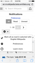
Checked in betalabs - the sidebar is suppressed; the page is usable, in terms of displaying and functionality. Checked with iPhone and Chrome mobile emulator (screenshots are below).
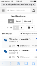
In iOS 9.3.2 (6s iPhone)
Notice that 'Preference' link is present (it's absent from desktop version).


Chrome mobile emulator presents the view without 'Preferences' link

But when a link is http://en.m.wikipedia.beta.wmflabs.org/wiki/Special:Notifications, 'Preferences' link is displayed (the same as on a real device).

Comment Actions
Thanks @Mooeypoo, can we make some adjustments here? I.e.,
- is there a reason we can't suppress the preferences link? Also
- When you and I went over the mobile layout, you hadn't added the cog in yet. Now it's floating on its own line. Would it be possible to move the cog up to be on the same line with the Read/Unread filters? Or on the line with the page title?
- (If you can do that, then close up the space where the cog was about halfway after.)
Thanks!
Comment Actions
Those were fixed up in the follow up commit -- https://gerrit.wikimedia.org/r/#/c/300687/
It's merged now, it should work in beta.
Comment Actions
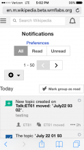
With pagination
The timestamps with weekdays are displayed now as e.g. 'Yesterday' or 'Friday' - filed as T141466: [betalabs] Mobile Special:Notifications page displays only weekday names
Preference link is gone
The cog icon is displayed under the Read/Unread filters (makes sense since it's logically grouped together with pagination controls)
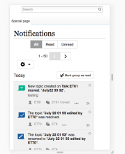
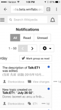
Without pagination

With pagination

The timestamps with weekdays are displayed now as e.g. 'Yesterday' or 'Friday' - filed as T141466: [betalabs] Mobile Special:Notifications page displays only weekday names
Comment Actions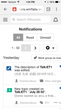
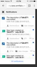
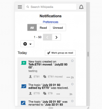
I'm seeing that the page doesn't fit on my iphone 5 screen. (See the screenshot below—as well as Elena's screnshots above.) This may be because the dotdotdot menus don't fit within the page frame when the links are longish? (See the second screenshot below.)
I see it also happens, though to a lesser degree, on the Notifications panel, which fits better but still has the dotdotdot problem, as you can see in the third screenshot (first message missing dotdot).
I don't know if it's worth the trouble to fix this; the page is usable, though ugly. @Mooeypoo, what do you think? What type of adjustments would be available and how much effort are they?


