Page MenuHomePhabricator

Video wider than visible screen on mobile
Closed, ResolvedPublic

Description

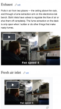
The video.js player keeps its defined width even on mobile, meaning that the video might stretch outside the visible screen.

[[File:Exhaust_fan_smoke_test.mp4|border|640px]]

image.png (2×1 px, 1 MB)

Setting the following CSS seems to fix it;

:not(.thumbinner) > .video-js.video-js:not(.vjs-fullscreen) {
    display: inline-block;
    vertical-align: initial;
    max-width: 100%;
    height: auto;
    padding-bottom: 56.25%;
}

image.png (2×1 px, 1 MB)

The padding is necessary to keep the video height from becoming 0. The value 56.25% is the percentage relation between height and width in 16:9 format. (It would be 75% is the video was 4:3).

So the padding percentage must be calculated based on the height/width ratio.

Event Timeline

brooke moved this task from Bugs to Active on the VideoJS player board.
brooke subscribed.

Going through the backlog of visible regressions to fix up; this may have been obsoleted by the switchover to the popup player dialog but let me check.

Ok, the popup dialog is good but the thumbnail still doesn't get shrunk as on https://deployment.m.wikimedia.beta.wmflabs.org/wiki/Video_test

Will test the suggested CSS, thanks. :)

Ok, that CSS doesn't take as it's for the post-transformed player. Looks like I need to redo how the placeholders are styled to make this work. :) Easy peasy, lemon squeezy...

Change 586421 had a related patch set uploaded (by Brion VIBBER; owner: Brion VIBBER):
[mediawiki/extensions/TimedMediaHandler@master] Shrink large videos to fit the page

https://gerrit.wikimedia.org/r/586421

Change 586421 merged by jenkins-bot:
[mediawiki/extensions/TimedMediaHandler@master] Shrink large videos to fit the page

https://gerrit.wikimedia.org/r/586421